Monday, November 29, 2010

Design in Society: Computer

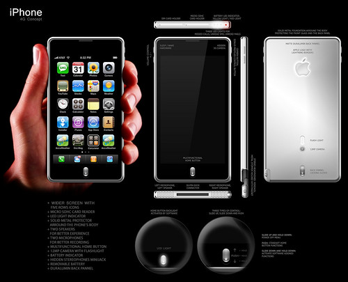
The Apple 1 computer, created by Steve Jobs and Steve Wozniak in March 1976, was one of the first computers to be out in the market and be available for human usage. This was the beginning design that has led to greater and better things and started a revolution of computer brands such as Acer, Compaq, Dell, eMachines, HP, Sony, Toshiba and of course, Apple.
The new modern version of the Apple 1 computer can be considered to be the Macbook Air, a thin laptop computer that has definitely had a makeover.

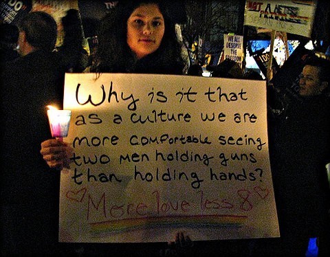
On the left, the Macbook Air is shown to be a thin computer with a very 21st century look to it. Computers in general have been a great asset to society with workload. The computer has helped many with PowerPoint presentations, homework, communication and many other programs that a computer has, are being used nationwide by billions of people. Not only is the computer helpful for workload but for communication as well thanks to the internet. Computers are used for the internet to stay connected with work, school, friends, family etc.
The design of an actual computer is something beneficial to society in which a computer's design contributes economically. Aesthetics of a computer is helpful appealing to the consumer, based on the color, size, and other designs that might be added to the computer to seem better than the others. The design of the computer of course augment the cost of the computer as well, helping increase the economy.
A computer in general helps move cycles easier and making life faster for many such as typing an essay on a computer and saving it rather than using a typewriter or writing by hand and then having to re-write the whole thing later on. As the years go on, computers will become more futuristic and will end up helping society even more by typing faster or being faster on the internet.

dG

Design is Dangerous: Technology

Normally when someone thinks about design, it is perceived as a positive impact on society. Although for a huge percentage of the time this definition is correct, design can be the end of society. Technology is something that I personally believe is a dangerous design altogether. My opinion is addressed in the movie "Wall-E" and the following clip emphasizes what we, as humans, can transform into if we let technology take over (fast forward to 1:05). Although the movie is a fictional story, this part of the movie makes a lot of sense when it comes to technology, seeing that it is taking over the people and that without their chairs, the people are useless, so useless that they can't even lift themselves off the floor when they fall. Technology is advancing quickly and we as a society are not ready; new iPods, new phones, televisions that are compatible with internet, cars that can park themselves, etc. The whole design of the advancing technology is supposed to help the average human lifestyle by simplifying their daily routine but the danger here is that technology is making life to simply for human beings, making them useless to society such as no longer seeing the craft of homemade meals without something that is already pre-made, or not being able to park our own car because our car is already programmed to do so. The whole idea that we are being taken over by technology is something that is repulsive to me
and the idea that we are also so open to these objects taking us over because we are blinded by the aesthetics of the product. Society is blinded by the "prettiness" of the new iPods and their features, the new Lexus and the ability of parking that it holds or the new robotic toy that can clean after you; humans are in danger of being taken over by technology, if it hasn't taken over already.

dG

Color Transforms

David Choe, muralist and graphic artist. In my mind, he defies color with his beautiful murals. Being an artist that has his artwork seen from the United States to Vietnam, he shows vulgarity by giving his art an aesthetic spin. Like many of this murals and artworks, Choe uses color to bring his pictures to life and give them bigger meaning. In the picture to the left, there is a woman that is surrounded by black, white and grey while her face gives off different color vibes, drawing the audience into her face. Referring to Josef Albers' book "Interaction of Color", there is a play of brightness in Choe's artwork. Color intensity is something that every human eye craves and looks out for in artwork and Choe does deliver with this piece. The color intensity is not really found in the black, white and grey until the colors are mixed but the real intensity is shown in the woman's face. Colors defy this woman, bringing more brightness to her lips, looking luscious and plump and her eyes have a distinct brightness. As Albers points out, there are different tastes in color when it comes to different color. For me, the lips and the eyes are the main parts of the painting that attract me to the painting altogether. I see colors differently from someone else because I can see a reder red than someone else that is seeing the same picture as me. Knowing that there are different view of color in this painting, society can see this design to be universal, one that communicates to different human eyes. This can be considered to be universal because of the many people that this painting can appeal and the different brightness or intensities that they might experience. I thank David Choe for his painting and I encourage him to continue with his work to make more paintings that can connect with society and have more communication through them such as color, pointed out by Josef Albers.

dG

Saturday, November 13, 2010

MacBook Air, the 2010 Generation

Recently, I was watching television at my dorm and the new Apple commercial seemed to pop up. The commercial was endorsing the new Apple product, the MacBook Air, a refined laptop that was sure to leave people speechless. This new addition to the Apple family is introduced in an advertisement on television and YouTube worldwide (shown above) focusing on one and only one main concept of the laptop, the design. As shown in the clip from YouTube, the video's simple message of the laptop is that it is sleek and that can be easily transported from one's hand to the table. In the beginning, the ad moves the camera around the sides of the laptop, showing some of the features that it includes such as USB connections, the charger input, and the connection for headphones. Showing these features in the clip assure the consumers that although the design of the MacBook Air has changed, Apple has confirmed that they are still including the same features to the new laptop as the other laptops that Apple has to offer. Also, the side show that the laptop goes from thick to slim, a different design that Apple has tried for the MacBook Air, something that can be definitely attractive to the consumer's optic sense. The hand in the video, holding the MacBook, demonstrates the slender features from a personal experience, coming from the person that is holding the laptop, once again, proving to their audience that their product does meet the features that they promised. The action of opening the laptop with one finger shows not only the slimness of the MacBook once again but it represents the weight of the screen, one that might be lightweight and simple to open. In the end of the video, there is a 180 degree turn in which the camera turns to display the screen and the profile of the MacBook and the name of the product, finishing the video.
Society was ready for the MacBook Air and Apple was by all means, in the right position to satisfy society. The MacBook Air's design attracts its audience simply by the title of the product. MacBook Air is such a tantalizing name in which leaves people questioning, "Why is this laptop called the MacBook Air?" but after looking at the commercial or at the advertising, one answers their own question. "Air" is part of the name because the laptop itself is lightweight and "MacBook" because of the brand, Apple. This is one item that connects conveniently to society for many of the features that are embedded into the product. We, as a society, like simplicity and the MacBook Air seems to satisfy those needs for a consumer, based on the actual design and the functions of the laptop. Design-wise, the MacBook Air helps by being so lightweight, something that is beneficial to people such as travelers, lawyers, college student, business people, etc. Focusing on the functions of the laptop, the MacBook has a battery life ranging from 5-7 hours, has Flash storage, a great track-pad/mouse, etc. In general, the MacBook Air has connected with its consumers with advertisements and the new slim design of their addition to the Apple family.

dG

http://www.apple.com/macbookair/

Nicki Minaj and Will.I.Am star in their new music video, "Check It Out" (the above clip), a new song that is popular in the United States. Within the video. Will.I.Am and Nicki Minaj not only connect to the population of the United States but made their music video connect with the Korean population. There were many instances where the Korean culture was shown in the design of the music video. One of the instances includes the Korean clothing. Being a fan of both Nicki Minaj and Will.I.Am, I am aware that the clothing that they both wear in the music video is not typically affiliated in their wardrobe. The clothing design as a whole is colorful and the design is more intricate especially in the hat and in the jumpsuit. Conversing with my design group in class, we came to the conclusion that the jumpsuit that Nicki Minaj wears in the middle of the music video can be seen as propaganda for a movie that is coming out in December by the name of "Tron". Although the jumpsuit has Korean roots, this was seen as propaganda simply because of the futuristic vibe that the suit gives out, which "Tron"focuses on. Korean is also optically seen in the music video from the 3D words that pop out, emphasizing the last words that are said by either Nicki Minaj or Will.I.Am. Focusing on society, this music video combines Korean and American mannerisms, united both countries into one culture wise. Nicki Minaj and Will.I.Am are communicating to their audience that they are open to other traditions and cultures, augmenting their chances of getting more view from different cultures simply because of the new Korean connection that they make.

dG

Monday, November 8, 2010

RUNAWAY


Kanye West, worldwide known rap artist and record producer, has moved on to greater and better things. He recently wrote a song called "Runaway" and he made a 35 minute video based on his new song. The video tells the story of a woman bird that seems to have fallen in planet Earth where she is lost in the mannerisms of the planet. Kanye stars in his own video portraying a character that finds this woman bird and helps he become one with society and take part of the human society. Throughout the video, Kanye West shows many angles of nature and dance, connecting to society and linking to the woman bird on her experience of planet Earth.
Although Kanye West is an amateur director, this is a perfect example of design in society. Before even starting looking at the video as a whole, the design of the woman bird, such as the wardrobe for the woman bird character, was a great design altogether; the feathers, the makeup with the long, white eyelashes, the sleek hair. The wardrobe was well designed to fit Selita Ebanks, model that portrayed woman bird, hugging her body. With this nice, fitting clothing design, Kanye was smart enough to fit the wardrobe with Ebanks' character, a woman bird that is lost and does not fit in with the rest of society, connecting with people in the audience for not connecting with society by either being different in their personality, clothing etc.
Moving on to the rest of the video, there are many scenes in which nature is placed randomly in the video and there is a connection between the woman bird and nature. Here, the design of society is seen in the video to be calm since it is shown the deer in the wild, sheep and birds are in there natural habitat or that they are helpful in connecting with the woman bird. The design is that there are animals in a calming environment, Kanye West's house, provoking the audience to feel calm with the woman bird.

dG

Collision of Word and Image

Posters. Physically, they can be made from paper, cardboard or a nice writing surface, that include writing of some sort. Posters can be attractive to the human eye either by the decor of the poster or by the writing. In this poster shown, the writing was what intrigued me and this is the reason why I have decided to include this picture in my blog. The sign is held by a girl which states "Why is it that as a culture we are more comfortable seeing two men holding guns than holding hands? More love less ", something that I am very strong about. Gay rights is something that I hold very dear to my heart and after reading this poster/picture, I felt my heart sink, something that the creator of the poster might have wanted his/her audience to experience. I remember that I had to read this picture multiple of times before I said, "They are so right."
The complete design of the poster connects not only to the audience but to the society as a whole. Even though the poster is not that decorated or appealing to the human eye, the message that is written in the poster is enough to make an audience question this and give their own opinion. Our society, at this point in time, is either accepting of the gay society or against the gay society and this poster just questions our society; are we really that ignorant that we are more open to men holding guns and starting violence than accepting a homosexual couple being intimate in public? This simple design of paper, use of marker and colors, evokes so much emotions and connects to society by asking a simple question; design, in this case, rules.

dG

WORD & IMAGE

Brian Fries, author and comic book artist, wrote and drew the book "Mom's Cancer", his and his family's experience dealing with his mother's cancer. The University of California, Davis had the privilege to have Mr. Fries come to the Design 001 class and give a lecture on his book, his experience with his mother and with main points to how he became to be, a comic book writer. The picture above gives an example of "Mom's Cancer", portraying Brian Fries' mother in agony. Although the picture could speak for itself, Fries decided to include words, explaining most of the items that are found next to his mother.
Word and image come together in this picture, where the image shows the agony that the mother is going through and we, as an audience, perceive with our eyes the atmosphere and the items that are found close to his mother. The words that link with the image are extremely helpful, not only to know what he images are but to know the meaning behind such objects. Fries knew that the image was not the only thing that would hook his readers but that he would need to draw them in more by explaining such things like the medicine that his mother was taking. Telling his readers these details about the image evoke emotions towards his mother and him for the hardships of cancer. Altogether, Brian Fries makes sure that image and word come together
in his comic book to express in detail what this journey of a cancer battle, provoking his readers to take part of his experience and to visually take a glimpse in what might be a life burden.

dG

Sunday, October 31, 2010

Interaction of Content & Form in OBJECTIFIED


On Friday, the movie, "Objectified" was shown in Design 001. Although we didn't get to finish the movie, this movie is simply mind blowing from the concepts that are shared in the movie to the different designs that are emphasized. Main topics that were shown in the movie include the focus in content and form within every day designs. There is a instant connection between content and form in the beginning with the example of the toothpick.Seeing the toothpick, I was confused as to why a toothpick was being analyzed and why would this be important. The content was the story behind the toothpick: Japan has toothpicks with special top tips in which the tip can be broken from the toothpick, indicating that the toothpick has been used and the tip can serve as a rest for the toothpick (picture shown) The toothpick, being the form of the content, is shown to be an everyday essential but no one seems to pay attention to its design. A toothpick is designed to help people with food in their teeth but no one really takes the time to see the real design of a simple toothpick. A toothpick's design is the following: a piece of wood, sometimes bamboo, sculpted to be short and thin with pointy tips to meet the necessity of people when picking their teeth. The simple design is very attractive to consumers for many reasons, such as the simplicity of the product.
Content and form are connected in design, shown in "Objectified", being that they have a story to share with the people that consume the product or design. Henry Ford once stated, "Every object tells a story, if you know how to read it.", and I believe strongly with this quote because if one does not know the story or content of one design or form then there is not story to tell.


dG

Wednesday, October 20, 2010

Garbage Design?


About a week and a half ago, Shine, a website run by Yahoo, came out with an article based on fashion design inspired by the states in the United States. The dress designs include the following: Minnesota had a corn dress, New York had a trash dress, Iowa's dress was based on the prairie, Nevada's dress was made of casino chips, Maine had a pine cone dress, and the list goes on. From the examples that were mentioned above, I was really attracted to the garbage dress inspired by New York and the garbage collection that occurs within the state.
The garbage dress was made out of a large amount of garbage bags that were used to compliment the model. The dress' form was created to be a side shoulder dress with a large skirt, where trash bags were tied to create volume and were puffed up (hopefully not with garbage) from smallest to largest. This is a design that definitely defines New York, trash all around and fashion overall. Looking at this dress, I find it to be quite appealing due to the great use of volume created by the garbage bags and the form all together seem to appeal my eye (even though this is circulated around garbage) . There is a balance that is made with the trash bags because the bags increase from the model's stomach area to the bottom of the skirt. As a society, we are ones that judge fashion and our nation as a whole but this dress to me creates a true vision of New York. New York is famous for fashion and being the "big apple", bringing society's view of fashion together into a design; something that is out of the box, simply unique and couture. Society simply accepts this design of a New York garbage dress.

dG

http://shine.yahoo.com/channel/beauty/artist-creates-themed-dress-sculptures-in-all-50-states-2400848/#photoViewer=1

Monday, October 18, 2010

A Trained Eye

When looking for a new appliance such as a cellphone, television, coffeemaker, what is the first thing that you think about? Is it the price of the appliance, the features that the appliance is capable of doing? No. The first thing that you are attracted to is the design of the appliance. Before even purchasing an item or going out to look for one, there is an immediate moment in which ones brain starts to put ideas together about how the appliance should look and what one is looking for. When going to the store, that is when it gets exciting for a consumer; aisles and aisle full with appliances and very interesting designs. The design that usually wins is the one that is appealing to the human eye and of course, ends up being the most expensive.
This manufacturing industry know how to play the game with its consumers and buyers. They know that the human eye is seduced by different colors and a design that is none like the others, one that is completely spontaneous and is considered to be "rare". A consumer is aware that when they are shopping, they must look for an appliance that will last a long time and have many functions but at the same time looks presentable and in the end, the design beats the features and the durability.

Society makes sure to manipulate society into focusing on the design of the product. One example of this includes the commercial above for an Apple iPhone 4th Generation. After looking at this commercial for a couple of times there is one thing that you notice, the design is emphasized for the most part. The beginning opens showing the design of the iPhone closely and then moves forward into showing a couple of features within the actual product but in the end, there is a list of some features that the phone has but they move to fast. This was done on purpose. The creator of this commercial did not want the features to be the main part of the commercial but it was the design that was the most important for the creator of the commercial to focus on. Simply, design prevails in society and most importantly, with consumers.

dG

Sunday, October 17, 2010

Comparison & Contrast


Fashion, every girl's dream. Michael Kors (left) and Alexander McQueen (right) are great examples of fashion that leave the runway and the audience, speechless. Both of these fashion designers have used their creative minds to create these pieces above that seem to have some similarities but also their comparisons. Michael Kors seems like the fashion designer that plays by the fashion rule book, keeping his pieces classy, still fashion oriented and what is in season. Alexander McQueen, on the other hand, experiments with his designs with colors, different fabric designs and goes forth to bring fantasy designs to real life. Both designers have different views in fashion, Michael Kors being a bit more conservative than Alexander McQueen and Alexander McQueen brings more of a wild side to his designs.
Although they might be different with their styles and their designs, Alexander McQueen and Michael Kors share many characteristics that may seem obvious but they are important in the fashion industry. They both have large collections for each season and they are able to have models strutting the runway with their designs. Another similarity that they have is that they are both designers that focus on what is in style during that season to add to their collection. Referring to the picture above, Michael Kors knew that during this season, purple, yellow, and lime green were colors that were a huge hit and that would bring more liveliness to his designs. For Alexander McQueen, he did not stay behind focusing his designs on extravagant uses of color and flowy dresses that would just swoosh back when the models were walking. Both designers are conscious of the designing world because with their designs, they communicate a part of who they are in terms of their taste and their personality, making it evident to the fashion audience that their tastes and them as people are different yet similar.

dG

Saturday, October 16, 2010

Design as a Conversation


Indeed, the sun is down. Above is a clip of Yoko Ono and Lady GaGa combining their talents of singing and creating what you see above. When I first listened to this video clip, I was in design class. I was quite confused in the beginning to why we were listening to this and how it tied into design. Mr. Housefield, my design teacher, later explain a main quality that this clip signified and that is crucial to design in general, communication. Communication is normally seen either verbally or written but not typically associated with visual images transferring information from one to another. Design needs communication to maintain a conversation with the intended audience based on the design presented, conveying the designers view of the world, of a specific topic etc.
Being a source of communication, design is such a broad topic to start a conversation with. Design can be a great source of conversation such as using the example above. One might start to talk about the design of Lady GaGa's extravagant clothing, or the design of the lyrics that are being used to converse between Lady GaGa and Yoko Ono. Conversation dealing with the design of many things is simple, starting with simply looking and analyzing at the design of an object. Questions that can run through people's minds looking at a design might be "What is this used for?", "What was the designer thinking when he was creating this design?" or "What does this design stand for?" Design is a simple way to convey what one is thinking or what one believes, commencing the conversation between a designer's audience. Having a visual design, it makes a conversation easy to have because one's opinion can be backed up with parts of the design, the color, the shape, the images that are being portrayed, etc. Design is a conversation between a designer and the world, commencing the conversation with the design.

dG

Monday, October 11, 2010

Kseniya Simonova, art animator

Kseniya Simonova is a name to know. I first saw this video when my Studio Art teacher, Mr. Barak Smith, showed me this incredible talent that was first seen on the show "Ukraine's Got Talent". Kseniya holds a talent that has not been seen and is quite rare. She has the ability to make sand animation, art that is created with the medium of sand using only sand and her fingers as tools to handle the sand. Her art is not one that can be preserved but the time that the art lasts, it is really miraculous. In the clip above, she is demonstrating her talent through a story line, something that is really creative, giving the art more meaning. The whole concept of this being an animation seems so surreal to me and to many people in the audience as well, especially in minute 5:22 when a woman is being taped to be crying.
Emotions are moved thanks to Kseniya not only because of her talent but with the story that she is telling based on World War II, an event in which many people lived through. To me, this is a great example of design, one that is not permanent but that definitely includes many elements of design; emotion, creativity, planning etc. The design of the sand was definitely played with by her fingers by making different shapes and moving on with the story along with the music that was playing in the background. The designs that she was making were more incredible because she did not have prior experience before coming to the show, and started with sand just as a hobby. The designs that she make convey a story of the past and animate it, coming to life and giving the audience a vivid action of what occurred during those times. My gratitude to Mr. Barak Smith for showing me this video and of course, to Kseniya Simonova for her art animation.

dG

Sunday, October 10, 2010

Creativity From Without


During my high school years, I was really involved in the art department, making my own pieces and going to formal events representing my school. When I would showcase my art, people would come to admire my work and there was a constant question that I was asked, "Where do you get your inspiration from?" To tell the truth, there was no exact answer. Inspiration, along with, creativity, for me, does not mean that I go looking for something to become inspired from and start to sketch or create something. Creativity and inspiration find me, and not the other way around. I think to myself, "Why would I go looking when it can easily find me?" Creativity is born from society, either it can be a good creativity, one that showcases the marvelous things that our society has to offer, or bad creativity, one that showcases the disaster that society is.
Looking back, I seem to be getting my creativity from myself, who I am as a person, what my interest are, from the people that I talk to and what I perceive society as. Many people think to themselves that they are not creative because they can't paint, sketch, draw etc. but the reality of the situation is that everyone is creative, but in their own way. Creativity is something that is made within each person and it just keeps growing as the time goes by based on what one has experienced throughout the years. Creativity is versatile, and once it comes to me, I know that it will be beyond my expectations.

dG

Wednesday, October 6, 2010

Stone Soup


In the 21st century, our design of Stone Soup consists those of the author, Marcia Brown but with a modern twist. The book, "Stone Soup" is folktale in which soldiers come back from work and are able to to get a whole town to come together to make stone soup. Mr. Housefield, my design teacher, modernized the idea of "Stone Soup", focusing on the design of the final "soup" or design. Collaboration was key when dealing with a large group of eight designers and with a large amount of supplies such as colorful paper, wire, duct tape, cotton paper plates, etc. , used to create the final piece. Having so many creative minds within the group, we found out that everyone has a different idea or taste of design that certainly came out in the final product. From gluing or taping items to a box to painting paper plates, the final design came out to simulate a piece of every designer in the group.
The picture above illustrates the final product of our "Stone Soup". What is it you ask? As a group, we decided to name our creation "Cloroful", mashing the words "colorful" and "cluster" together. One main thing to know is that not anyone in our group could decipher what the design was in terms of an animal, person, etc.; we simply focused on getting all our ideas for designs into an even bigger design. Looking back, I know that I, personally, focused on color for my part of the collaboration. Having an art background from my high school years, I knew that the human eye could not rebel against color; instead, the human eye would be hypnotized and drawn in even more.

dG

Monday, October 4, 2010

San Diego, Slow Down & Enjoy the Walkway

Living in San Diego all my life, I was used to the city life; a fast pace life in which people would look down to their watches and dash to get a bite to eat and make it back in time to clock in. To me, it seemed that San Diego had no peaceful places, were people could do what seemed impossible, sit down and relax. Balboa park, I soon found out, was a utopia filled with museums, nature and tranquility.
The building to the right is part of a walkway in Balboa park, a wonderful piece of architecture that just screams design. The design, as a whole, can be described with a simple word: remarkable. To me it seems like something that is impossible to design in a piece of paper, nonetheless creating it in 2D for people to enjoy. This specific walkway's design shows signs of the Baroque time period where everything was based on simplicity, the simple the better. Although a lot of detail is being shown, the whole atmosphere of the location plus the architecture adds to the design ,a simple design yet being related to the Baroque time period, there is a lot of ornamentation. Ornamentation includes the intricate detail of the shadows that are made from the curves that were made in the architecture and the half domes that are created as a pattern.
Remembering the first time that I went to Balboa park and went through the walkway, two events occurred. The first, I had to go twice through the walkway. Why you ask? Well, simply because I couldn't grasp the beauty of the building the first time, therefore I had to go once again through the walkway to slowly grasp the wonderful design of the structure, the height, the length of the walkway and the nature around the walkway. Secondly, the pure touch of the building was unbelievable; the way that the curves and the broken lines felt through my fingers and the shadows that were made because of the intricate design of the building. San Diego, a fast pace city, minus the design of Balboa park.
dG

GaGasign?

Stefani Joanne Angelina Germanotta. Simply, she is Lady GaGa. She is considered to be the most popular pop artist, has had six constant number one hit songs (making music history), she has sold the most digital records, and she has won infamous amounts of awards including a Grammy. So, her being a pop artist, why is she in my design blog? Simple answer being that she is a walking design. Above I have supplied a picture of three of her clothes designs, ending up in tabloids after she worn them to award shows. Watching the media, seeing it in print or just by word of mouth, we, as a society, are used to being conservative about what we wear but huge on brands like Dolce and Gabbana, Prada, Louis Vuitton and etc. Naturally, Lady GaGa entered the industry and she completely left everyone with a wide open mouth; from wearing leotards, to wearing a meat dress with matching purse and Alexander McQueen shoes. She challenged, and is still challenging, the boundaries and goes extreme with the limits, making sure that when she is out in public, she will be noticed and recognized, not simply because of her celebrity figure but because of what she is wearing.

After Lady GaGa goes in public and the media reports about her clothing design all around the world, friends come up to me and ask me, “Did you hear and see what GaGa was wearing? What did you think of it?” Being a GaGa fanatic, I answer “Yes and I thought it was fabulous”. Many people may disagree with me by this time in blog, stating that GaGa is just being crazy and she does it for the attention but to that, I say poppycock. Lady GaGa is a woman that is aware of who she is and most definitely, what she wears; she wears those “crazy” and “outrageous” attire to show society that her clothing, her design of who she is and what she wears, is as real as society can get. Her clothing design proves to the international society that there may be boundaries, but those boundaries are fun to play with, just like art. The design of her clothing altogether bothers society simply because it’s nothing that we are used to seeing on celebrities or on people. Simple enough, Lady GaGa is design, and for that, I thank her.

dG

Sunday, October 3, 2010

The Design of Crayolas

Growing up, I was never one to be fascinated with colors. As a matter of fact, I learned the name of the colors after I learned how to read, write, and do math. Crayola intrigued my taste for design simply because of its structure, a stick of colored wax with a magical tip and well designed label. The label was something that brought my attention the most, the way that the logo was always in the center of the colored paper, how the simple wavy lines on the sides of the paper would dance when I colored and how easy it was to get rid of the paper and unleash a naked Crayola. Smelling the wax before and after use was different, the brand new smell of a never before used Crayola was welcoming but after, the smell that penetrated the paper and your hands was sweet and congratulatory for using the Crayola. The sensation consisted of a rough paper that hid a smooth Crayola that was easy to use, placing the tip on a piece of paper and let imagination go wild. When drawing, pieces of wax would separate themselves from the whole Crayola, leading to the shavings to either end up in the drawing or in your hands, an annoying sensation where the shavings were rough. A simple design made it easily accessible to not only utilize but to place back in the box, in a bag, in a desk, etc. Crayola came out to be such a well made design that other companies derived their own design, creating a revolution of coloring sticks that up to this day, are still quite popular. Yes, Crayola was successful with its design and continues to produce in bulk much of the design that marks memories for many.

dG